
by Paula Johnson
How a business sells itself has become almost as big a business as the corporation itself. Just selling a product isn’t enough in today’s world. Having a Business Plan isn’t a one-page wonder anymore. Finding a market, reaching that market, building that market and keeping that market isn’t even as simple as placing an ad.
Today’s businesses and corporations go to great lengths for our money and continued money. Many of those cute logos are not necessarily what they may seem.
When Amazon began, its primary market was selling books – “Earth’s biggest bookstore.” As the company and its market changed and grew, so did the logo. Most often the Amazon logo has been simplified to just a swoosh with an arrow. It looks almost like a smile with a crook on one end. But the total logo is the name “amazon” with the arrow “smile” swoosh from the “a” to the “z.” This reflects two aspects of the company’s direction: (1) it sells everything from A-Z and (2) the customers should feel ease and happiness in every transaction.
Long before Culver’s had its Flavor of the Day, Baskin Robbins offered 31 flavors of ice cream. Some of you may even remember Howard Johnson’s 28 flavors. Howard Johnson’s began in 1925 with its signature meal of tender friend clams (our Uncle Gerry’s favorite) and offering 28 different ice cream flavors. Yet, a set of brothers (Bert Baskin and Irv Robbins) thought that people deserved 31! One for each day of the month! In 1945 Baskin-Robbins launched their 31 Flavors.
Even though Baskin-Robbins has more than 31 flavors, 31 different flavors are always available at any store on every day. But the promise doesn’t stop with its mission. Look closely at the logo – BR!
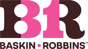
If you separate the letter “B” and the letter “R”, put the back end of the “B” and the front end of the “R” in pink with the two outer letters parts in blue – Eureka! You will see 31 in the center. A promise made and a promise seen.
Another frequently seen and overseen logo is the one for Federal Express. Federal Express has been around since 1971. The business name has since been shortened to FedEx and in 1994 a new logo was created. As many people will testify, creativity isn’t overnight. Nor is the result the same as the starting point.
Ever see those puzzles where the young woman is also the old hag? The new FedEx logo is much like that. In the “negative space” between the “E” and the “x”, an arrow appears. It wasn’t intentional, but it was fortuitous. That arrow now suggests that FedEx is the best way for a package to go from pick up or drop off to delivery “with speed and precision.”
If you shop in the chips and snacks aisle of the grocery store, the variety of chips (potato, corn, cheese, etc.) is almost overpowering. Even choosing one kind of chip doesn’t narrow the selection much. Brand after brand assaults the buyer as he or she fights through the choices.
When Tostitos created its logo for all their products (chips, salsas, dips), the concept of a party was the main thought. So, look closely at the brand name. In the center of the name, the two “t’s” surrounding the “I” are like people. The “I” is dotted with a bowl of salsa with a chip above it. It’s a party of two people enjoying chips and salsa.
When my Aunt Bobbi would visit her great grandchildren, she would always ask, “Who wants kisses?” “Me, me!” would come the replies. Then she would reach into her bag and pull out a plastic storage bag filled with Hershey kisses. The squeals would begin and Aunt Bobbi was center stage.
Hershey kisses have been around since 1907 (the year our dad was born). Now anyone in the world can buy them and they come in holiday wrapping and other assorted special packing. Their unique shape is a symbol recognized by everyone. Did you know, though, that there is a “kiss” in the logo? The next time you see a package, tilt your head a bit to the left, look at the space between the “k” and “I” – do you see it?
Companies spend big money to attract our purchases. Maybe not only enjoying their products, but appreciating their logos are also in order. The next time you ask someone what he or she is doing, if they say that they are thinking – or even doodling – don’t interrupt, it could be big money!
Leave a Reply
You must be logged in to post a comment.